Thursday, July 23, 2015

THE PERFECT OPPORTUNITY!

Summer fun is in full swing and the days are swooshing by much too quickly!  But there is still time to fit in some quick décor freshening tips to perk up any room that perhaps is looking a bit tired.

PAINT

A simple fresh coat of paint is transforming!  Choosing a neutral is always safe and makes a classic backdrop for many, many accent colors.  Try the newest neutral…..grey!  Unsure of what shade?  MariaKillam.com and her Color Me Happy blog is a great color expert to consult!

gray paint from bhg

Warm Gray Paint Colors::from top to bottom::Winter Gates AC-30(BM)/Coastal Pleasure 5048(ace)/Promotion 10D3(truevalue)/Seal Grey GLN46(glidden)/Silver Drop 790C-2(behr)

WINDOWS

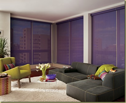
Clear away dark and dingy with fresh and light neutrals at the windows! The light shining through your window openings should illuminate your room and help create charm and atmosphere.

silhouette_ultraglide_livingroom_6

Neutrals are always a safe choice and blending backdrop, but don’t be afraid to venture into color as the effect can be dramatic!  Check out the variety of possibilities at Hunter Douglas.com!

designerscreen_powerrisetwoone_livingroom

A TOUCH OF GREEN LIFE

A designer friend recently reminded me of the importance of a living presence in a room.  If you have a green thumb, certainly add a potted plant for texture as well as its natural air filtering qualities! A few branches in a glass vase are a quick and simple statement of design and easily changeable and low maintenance for those of us with no green thumb!

architella_closed_5

PILLOWS

This is an extremely fun and easy accessory to use for seasonal accents!  Pillows, even in the most neutral rooms, can add color, texture, focal point, and impact!

pillows

 Summer is not yet over and is the perfect opportunity to throw open the doors and windows and let creativity flow in.  Be inspired! Venture out and have fun!

Please feel free to contact me with any questions regarding your window treatment dilemmas!out and have fun!


Friday, March 27, 2015

TICKLED PINK IT’S SPRING!

I am generally not a pink person!  But with the arrival of Spring,  I find the color pink catches my eye more than usual in interior design.  Perhaps because I am emerging from winter’s grey & white landscape that pink appeals so inviting and enticing…like a giant cupcake after dieting!

pink flowers

Spring issues of home decorating magazines and web sites explode with the fresh, fluffy shade and rightly so!  It has been a long winter and our eyes need refreshment!

pink window seat 2

Pink is often paired with white for that sweet, fresh look!

Pink Balloon Shade

Soft and soothing!

Pink Drapery

But when paired with brown or beige, it becomes very sophisticated!

pink drapery in mirror

More intense shades are so inviting and glamorous when accompanied with gold accents!

pink drapery 2

Pink evokes smiles and a sense of serenity!

pink and coral

Look at this touch of coral with pink! Stately touches of glass and gold! Oh my!

pink shutters

So even if you are not a “pink” person, let the freshness of this color invade your life for a season.  Spring is such a short time after all!

Enjoy!

Please feel free to contact me with any questions regarding your window treatment dilemmas!

Saturday, February 14, 2015

NO “WINTER BLUES” HERE!

Voted people’s all time favorite, blue is a color you really can’t go wrong with when used in design.  “Blue is the only color which maintains its own character in all its tones….it will always stay blue.”

Raoul Dufy, French Fauvist Painter, 1877-1953

fce966c40764d3aa32eaa1749cedb88b65931900e41d9099d65df7c693de9cdc

“Blue is strong and provides a nice clean statement,” says New York designer Matthew Patrick Smyth.

577e4d265e74660cce5aace9069ad754

“Blue is one of the easiest colors to live with and is most people's favorite hue,” says New York designer      Bunny Williams. “There are so many beautiful shades of blue—some cool, some warm, and they mix well together. If you use several blues in a room, they do not have to match; they just need to blend.”

92c791bf96eeaf3286bdc98628dd2a6e

“Blue ignites yet calms me; it is a mood-altering color of pure alchemy,” says New York designer Eric Cohler.          

“Blue is often thought of as a cool hue, but it belies this myth, providing warmth and comfort. Think of the sky and the sea: Blue is elemental.”

db2e0d8c34a52b940f0343fdc60f4bec

“Blue is one of my favorite colors,” says Jesse Carrier, who runs the New York design firm Carrier and Company with his wife, Mara Miller. “I find it both soothing and invigorating at the same time. It’s peaceful yet bold.”

ad52634f413d2d8da290616ce4c87bd9

“Whether a space is large or small, blue always says to me ‘I’m happy and relaxed,’” says New York designer Victoria Hagan.

42a1516af6e1125d56d5e4a2aaeb80d3

(Below): Teal Blue Paint Colors (from top: Moroccan Blue by True Value, New World by Dutch Boy, Teal Zeal by Olympic, Tidewater by Sherwin-Williams, and Gypsy Teal by Valspar)

320a1bc0eaa53c39c5e9f91a112f5c9d

Embrace color courage and select a blue

that speaks to you!

Enjoy!!!

Please feel free to contact me with any questions regarding your window treatment dilemmas.

Saturday, December 20, 2014

SO THIS IS CHRISTMAS….

Christmas in CroatiaSo this is Christmas
And what have you done
Another year over
And a new one just begun
And so this is Christmas
I hope you have fun
The near and the dear one
The old and the young

OLD AND YOUND HANDS
A very Merry Christmas
And a happy New Year
Let's hope it's a good one
Without any fear

0aaa58d73e472fbd9b13c11376c598b4
And so this is Christmas (war is over)
For weak and for strong (if you want it)
For rich and the poor ones (war is over)
The world is so wrong (now)
And so happy Christmas (war is over)
For black and for white (if you want it)
For yellow and red ones (war is over)
Let's stop all the fight (now)

c0fa2ba99e77c304e1a34967ae11d497
A very Merry Christmas
And a happy New Year
Let's hope it's a good one
Without any fear


2d74150bece0f274c7f81f54f225e556

Happy Christmas!


(Lyrics by John Lennon and photos Tumblr)

Tuesday, September 23, 2014

THE ART OF WINDOW TREATMENT

I have discovered yet another designer full of youthful inspiration and exuberant creativity that will keep you in your seat reading post after post!

Nichole Jacobson of Jacobson Interior Design

Posted on April 23, 2013 by Erisha

Window treatments – that oft overlooked design element – can be hugely impactful to great room design. It tends to be the last thing we think about (much to the room’s detriment!) when we plan our design. Simply put, they’re one of the best ways to help express a unique design aesthetic and punch up the room’s personality.

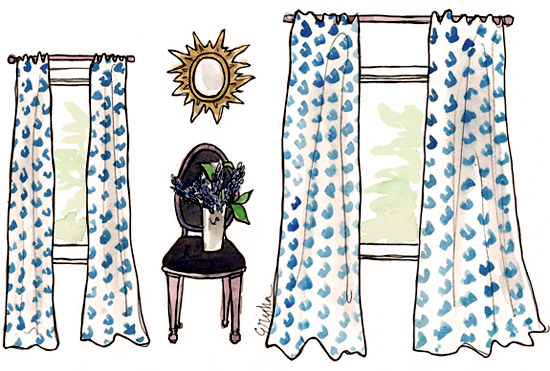
There are tons of reasons to consider your window treatment, but first, please consider The Golden Rule of drape placement.

DON’T:                                                                          DO:

41813Drapes

These two windows are exactly the same size, but the window on the right looks much larger. This, my friends is the secret to hanging draperies. Always, always, hang your drapes to the ceiling! Where possible, extend the drapes wider horizontally. This will make so much difference folks! Just say no to bad drape placement.

So, what are the advantages of a great window treatment?

1e3ee874acca306b23141bcb8f00840f

More From the Desk of Jacobson Interiors

As always, we are interested in your feedback and questions regarding window coverings! 

Saturday, June 14, 2014

EXUBERANT WITH DETAIL AND COLOR

This title, descriptive words from her own web site, sums up the delightful design style of 

Mayme Baker Studio.  I recently became aware of  this sassy and sophisticated  interior designer via

The French Tangerine  (yet another source of fantastic inspiration!)

994a00530ba5b742020416f6bd2c13de

Using her own words….

“Compelling yet calming….”

6e75b4284fbff5b6ac848c52dadd5fa9

“Layered and  lovely in spirit….”

moremayme

“Appearing spontaneous…..”

eb658298aff35a9f0808451968cb1128

“…effortless and collected.”

mayme-baker-fun2

What really sold me was her attitude of fun and belief in surrounding ourselves with beauty and items we love.  Mayme Baker’s

What We Believe statement is a joy to read and makes the heart smile!

Enjoy!

Thursday, March 13, 2014

BUFFALOS AREN’T PLAID!

I know!  Old joke!  But you have to admit, it is an odd word combination to describe such a popular and adored  print in the design industry.  We all love it though and my favorite combination is blue and white!

4aa6b29fc7f0de7e3ddcdd1f80831162

Blue is such a popular color this Spring 2014 and

paired with white, it is superbly fresh and friendly!

ec46e5eab5b577cfe08fcc2f37e925aa

It lends itself to a multitude of design options….

5a198339a7718b1e3f2ec30e0205b485

Always making a happy statement!

midwest living56f3df8ce3d3c47f952c70df9c344953

In whatever application, it is sure to

compliment many colors….

242fe3e1e8e45b8517e9fcedffb922a3

and many décor styles!

8f4aaf7aca12c2d2835df39d1161ee60

Just be sure to use it sparingly

as too much is….ah well….too much!

We look forward to your visit or

any questions regarding window covering dilemmas!

LinkWithin

Related Posts Plugin for WordPress, Blogger...