2012 Color of the Year:
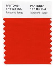
Tangerine Tango


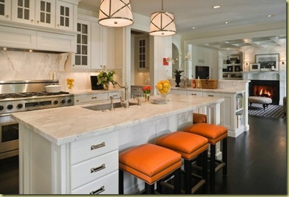
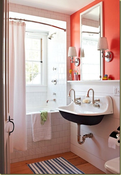
Known as Pantone 17-463 among members of the interior design community (and simply “Tangie” to family and friends), tangerine tango is described by the color-matching company as “a vivacious, enticing hue,” “a provocative go-getter” that’s “a bit exotic, but in a very friendly, non-threatening way” and “a spirited reddish orange … Sophisticated but at the same time dramatic and seductive.”
Reprint courtesy Re-Do it Design
A Home Decor, Interior Design and Color Trends Resource courtesy of http://www.MyHomeFaceLift.com
Here is the full Pantone color release for Interiors & Furnishings, and Pantone’s own color stories regarding all nine color palettes! I don’t normally quote content, but as the creators, I thought you might be interested in reading Pantone’s reflections about the creative process behind this year’s color trends, straight from the source. Everyone will have favorites, but I love “The Comics” for this group’s fearless and pure color bravado. Throughout this week, I’ll take a look at the color palettes individually, and hopefully contribute meaningful thoughts and impressions on making these diverse color groups work in your home, in 2012 and beyond…
“The nine palettes for 2012 are: Nonchalance, Subtleties, Resilience, Indigo Effects, and Transcending Time, Back to the Fuchsia, Reflections, Nouveau Neon and The Comics”.
Pantone Nonchalance Palette:


“The simplicity and casual ambiance in this palette, called Nonchalance, are easy to read and enjoy. The reassuring colors coax a feeling of tranquility and relaxation with no suggestion of anxiety in the surroundings. The comforting pastel pinks, ethereal blues and soft egret white wrap us in carefree baby blanket colors, harmoniously blending with the more mature taupe, gray and grape tones”.
Pantone Subtleties Palette


Subtleties are just that –
a close connectivity between the color families, sliding effortlessly into a seamless collection of hues that are either closely related or quietly complementary. The atmosphere they present is effortless and compatible: hazy coral, soft yellow green, faded rose, stonewashed blue and tinges of gray and green artfully set against a tasteful brown earthy red.
Pantone Resilience Palette


Resilience represents a group of sturdy hues that work very well together. It speaks of hand-hewn objects of substance, sustenance and solidity in a range of natural, outdoor shades. There are nuances of the deepest browns, varietal mushroom tones, foliage green and greenish yellow. A dash of flamingo orange adds an exotic touch to this otherwise organic grouping.
Pantone Indigo Effects


Like the twilight colors of a descending night sky, Indigo Effects evokes a mood of broad expansiveness and depth – enveloping and protective, yet mysterious. The colors are variations on a blue theme – celestial and majestic blues, purpled and deep blue indigos – all deftly brushed with contrasting strokes of maroon, mauve and moody gray.
Pantone Transcending Time Color Palette


Transcending Time is a palette that speaks of continuity – inspirations from the past, both style and color-wise, which continue well into the future – containing hues that heirlooms are made of, including elegant wine and plum, warm beige and wood tones, as well as classic rose. A touch of frosted almond adds a soft and subtle glimmer to the atmosphere.
Pantone Back To Fuchsia


Bold, daring and audacious, this is a group of tantalizing colors that makes no excuses for the attention it creates. Back to the Fuchsia celebrates the energy generated through the provocative melding of dancing reds, purples and pink, all highlighted by a variety of fuchsias. Jewel-toned peridot both accentuates and complements the hotter hues.
Pantone Reflections Palette


Glossy finish and color are a magical coupling, fascinating the eye and riveting attention. Metallic or glassy surfaces undulate and move and twist and turn, taking colors to new dimensions. Included in this arresting palette, called Reflections, are tones and tints that spark the imagination: Turkish sea, blue moon, garnet, beluga, cloud dancer as well as the classic silver and gold.
Pantone Nouveau Neon


The colors of the Nouveau Neon palette are not the phosphorescent neon’s of yesterday. They are instead a collection of exuberant shades that bring a fresh new perspective to combinations. Asian-inspired bamboo yellow-green plays with orange Popsicle® and berry purples, while citrus colors toy with pink and raspberry. A flavorful butter-rum tan is the unexpected accompaniment to all of the vibrant colors in the palette.
Taken directly from Pantone’s press release, and Chicago unveiling of the Spring/Summer 2012 Color Trends Report.


