“Then you should say what you mean,' the March Hare went on. `I do,' Alice hastily replied; `at least - at least I mean what I say - that's the same thing, you know.'”
- Lewis Carroll
March is sooooooo difficult to endure because it is so very close to spring yet this month keeps spring just an agonizing arm’s length away!!! It is like sitting and watching the clock, waiting for the minutes to pass in anticipation of a wonderful moment. Well, as one designer said to me with all seriousness this week, “God promised me spring will come!”
In the waiting hours, we can take stock of the new 2011 Spring Pantone colors that will grace our fabric books and clothing racks.
Now, I have to admit, I have a love/hate relationship with this year’s palette. Maybe I‘ve lived in Michigan too long but I would rather work with them in my closet than on the walls, windows coverings, or furniture in my client’s home. This palette is not as enduring as my favorite shades of these color families and seem to tire my eyes easily. Bright and fun for spring and summer but then I’ll be ready to move on!
Now before you tell me I am sounding old and frumpy, I’ll have you know that there is nothing like a playful spring fling (let me clarify….with the color palette!) to invigorate, energize, add pizzazz to our seemingly dreary decors this time of year. However, I know by fall I will be ready for the deeper versions of these colors……and Kravet has already got that covered.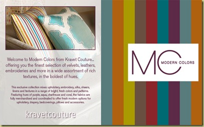
However, if I must choose, I do have a couple of favorites like this blue below! But I dare say it might be because of the dress! Pamela Roland by Pamela DeVos. I knew you recognized her sleek , flirtatious style!

Blue Curacao Pantone 15-4825 reminds me of a “softer version of turquoise” as described by 10rooms.BlogSpot.com which by the way is a super blog.
Then there is Silver Peony Pantone 12-1206 and Silver Cloud Pantone 15-4502!

love
love
love
Peony is also a beautiful shade in the Hunter Douglas Duette Architella cellular shade collection where we can enjoy our spring palette and have energy efficiency also!
A color also finding favor is Beeswax Pantone 14-0941 even though the mere mention of “bee” sends me swatting and running for cover.
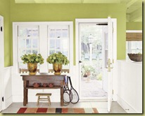
I love honey and I love this version of yellow. I love warm tones and I love that yellow is making such a come back in our design palettes.
Well, if pressed, I would have to say Coral Rose Pantone 16-13349 is another growing favorite.
It just sounds beautiful and exotic, doesn’t it? Imagine this warm orange paired with black & white zebra stripe!
Again, Hunter Douglas carries a very similar color of Mandarin Coral in their Duette Ariosa honeycomb shade collection. Who says smart energy solutions need to be boring?
I can’t help but like this color, Russet Pantone 18-1235 as it reminds me of chocolate pudding and makes such a yummy backdrop in this picture.
This photo is from Mary McGee Interiors.
It is not one of my favorite shades because of its peachy undertones….but it still reminds me of chocolate pudding. Mmmmmmm!
Next to last… but not least….well, yes, maybe least is Lavender Pantone 15-3817 and Peapod Pantone 14-6324/However, you have to admit that silver and silk in the photo below does make the lavender appear enticing….
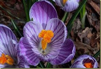
According to Leatrice Eiseman, “Purple is the most creative color.”
Fortunately for Peapod it photographs better than it really is…….and it is a version of green…..and a sign of spring!
Now….last AND least is Honeysuckle Pantone 18-2120. I could not even find an interior photo that I wanted to post. Sorry all you pink lovers.
“People are looking for something that gives them a lift. Everyone has been feeling a bit lethargic from the economy, the mood or whatever this is. Honeysuckle is a feel-good color,” Leatrice Eiseman said.
Well maybe I’ll feel “good” after I take my Pepto-Bismol which I am tempted to rename “Honeysuckle Juice”!
So you understand that these are just MY opinions and, like Alice in Wonderland, “ I think I mean what I say” but always reserve the right to change my mind. That is why I would love to hear your thoughts and opinions. Please feel free to share your favorites colors and/or least favorites.






No comments:
Post a Comment